welcome back fam! we’re on part two of how to wear color
This time I’ll be discussing color groups (or harmonies) & emotions with you all. In case you missed part one – click here
color harmonies
Some colors (technically) go better together than others. When they do, we call this a color harmony. Simply said: something that is pleasing to the eye. It engages the viewer and creates an inner sense of order, a balance in the visual experience. So obviously when something is not harmonious, it’s either considered boring or chaotic.
There are a ton of color harmonies. And many are based on the color schemes I discussed in part one. Two of my personal faves:
1
nature
This is the most common one. Makes sense, cause who doesn’t love the hues of nature? Blue sea, green palms and white beaches, here for it.
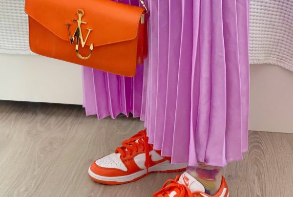
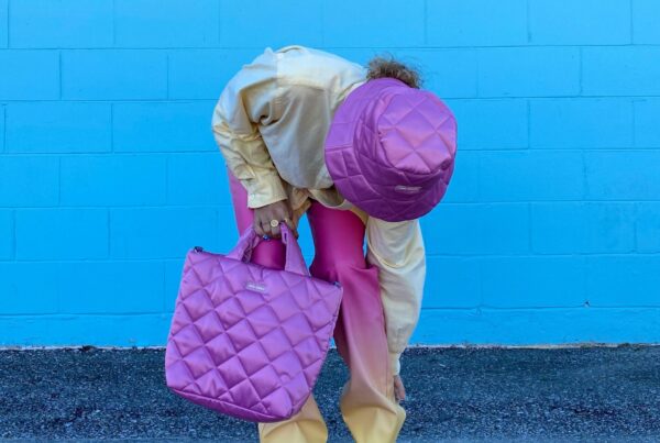
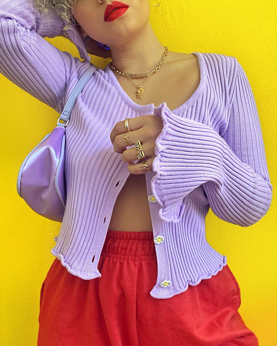
2
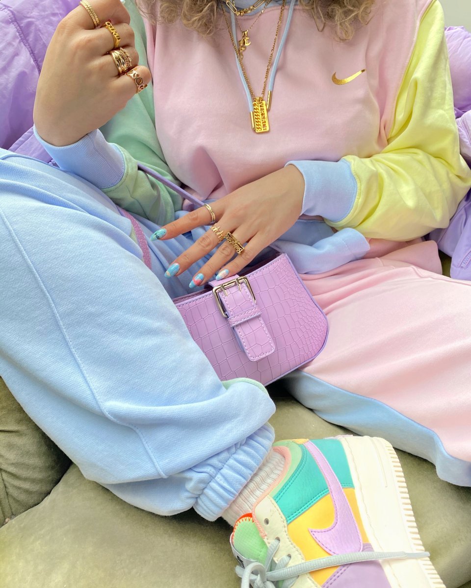
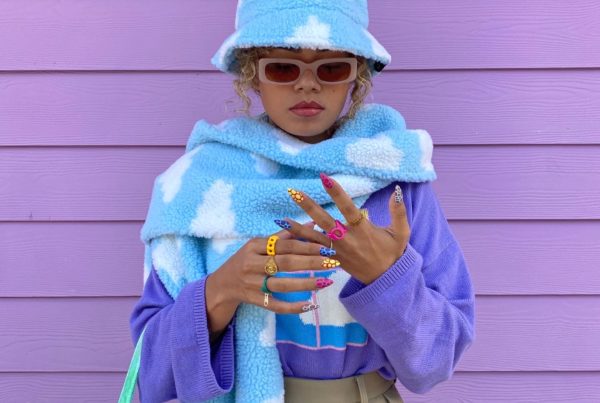
pastels
My absolute all time favorite is pastels. Even when every item you wear is a different pastel color, it will still look very balanced and at ease.
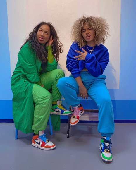
Colors are moods
Colors spark a variety of emotions. They’re moods, vibes, a feeling. Just like brands use certain colors in their advantage, you may be able to do the same for your own self-expression.. Here’s a list of a few colors and what impact they have on us:
so what did we learn today?
Colors have the power to change your mood
It can affect your emotions
And they can become a big part of your identity.
how to wear color — part one