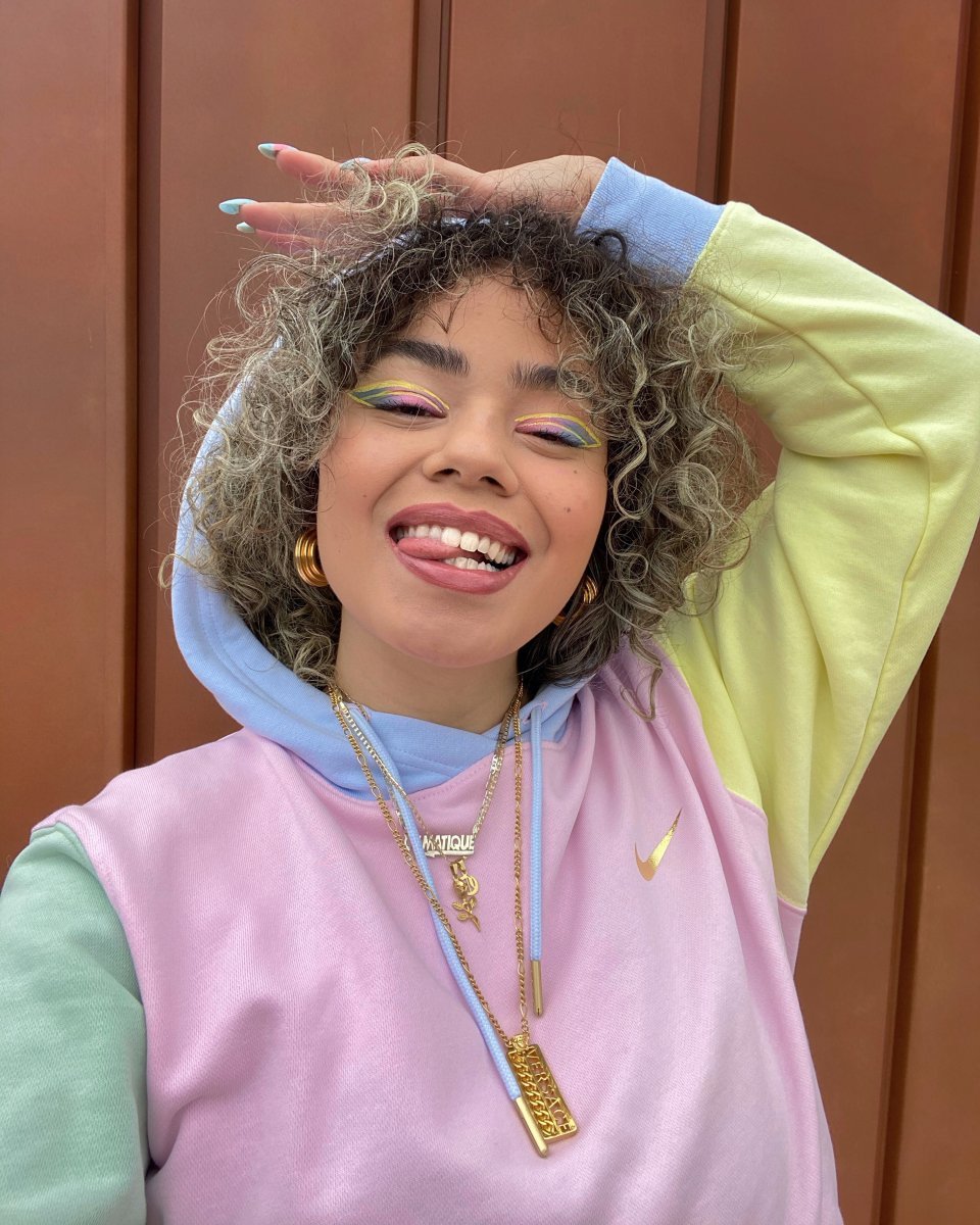
as a true color enthusiast, I made it my mission for other people to wear more color as well.
But, as natural as it is to me, it isn’t for everyone. So, how do YOU wear color? And how can you replace a minimalistic wardrobe mainly consisting of black and dark colors to a more vibrant one? In these 4-part series of How to Wear Color I will tell and show you how to do it!

why most people wear black or dark colors
- it’s a safe choice (colors make people feel as if everyone is noticing them), to save coins (not a lot of mixing and matching needed) and weather conditions (in winter people tend to dress in darker tones). Well, not me. I look at wearing color way differently. Color is my biggest inspiration and it cheers up my mood instantly. Obviously, there are also people who don’t really care what they wear. And that is also totally fine. I’m writing these posts for the people who actually WANT to wear color. So, if you’re one of them, I really hope this will help you.
first things first: the basics
You need to learn a thing or two about color before you can start wearing more of it. Not many of you might know that both of my parents are in fashion for over 35 years. So, they also taught me a thing or two about materials, design, trends and colors.
your new best friend: the color wheel
The color wheel is basically a tool that makes color relationships easy to see by dividing them into 12 basic hues:
- 3 primary colors (red, blue and yellow)
- 3 secondaries (orange, green, violet)
- and 6 tertiaries (red orange, yellow orange, yellow green, blue green, blue purple, red purple)
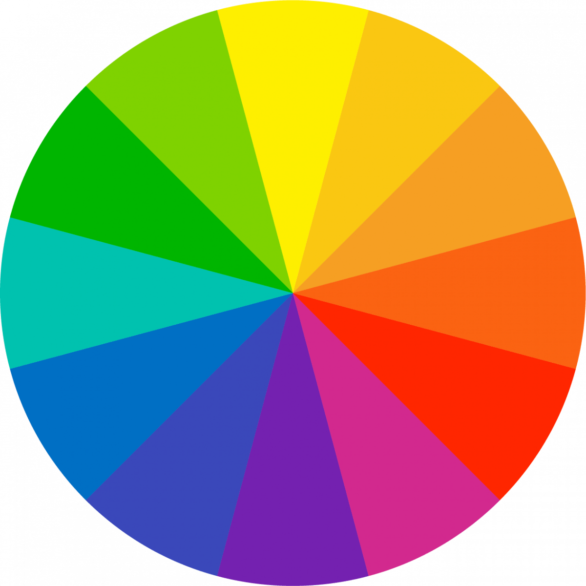
Primary colors are pure, you can’t create these from other colors.
All the other colors are created from those primary colors.
What's also relevant for now when it comes to outfits is color schemes.
- these 4 are most common ↓
1
monochromatic
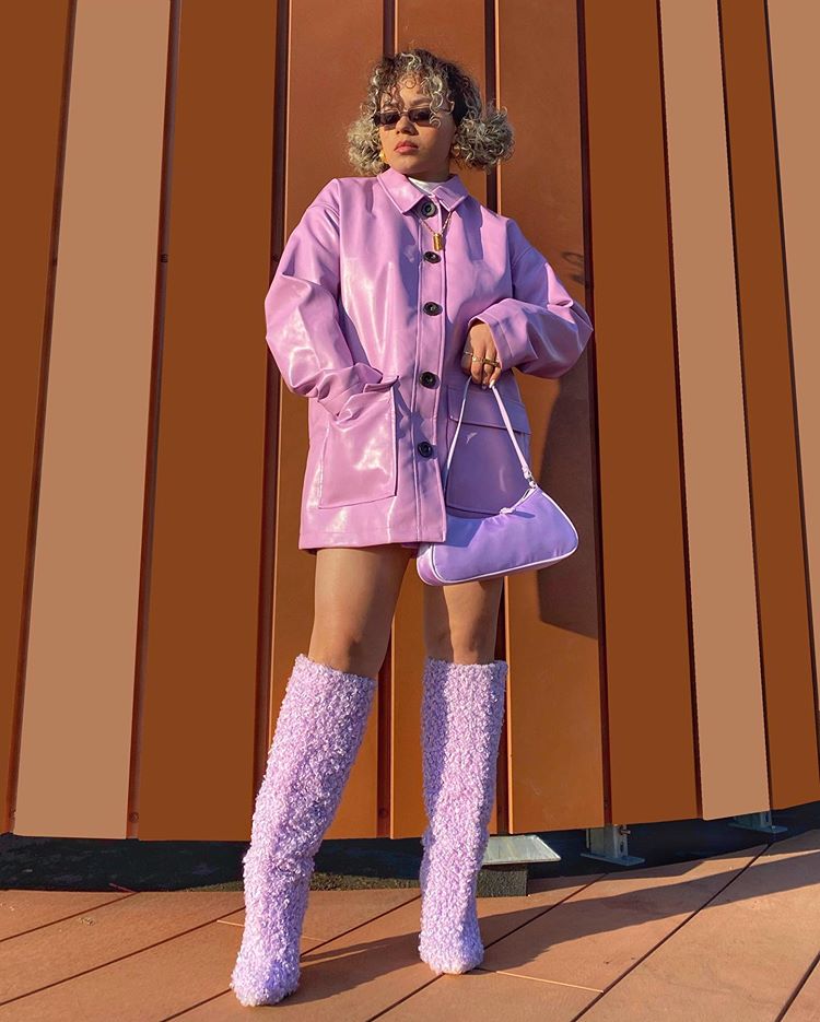
One of my favorites. It’s simply tone-on-tone combinations using several shades and tints of 1 hue. Little side info: a shade is a color mixed with black, a tint is a color mixed with white!
2
analogous

This scheme is to create a little bit of contrast using the colors you find side by side on the wheel. All time fav combos for me are reds together with violet/pink hues, like the faux fur coat I’m wearing!
3
contrast
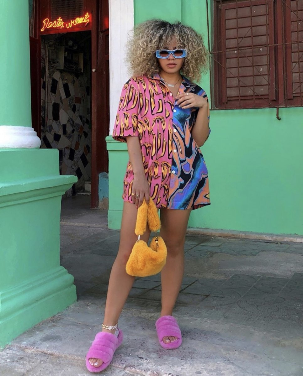
If you use three hues evenly spaced on the wheel, such as blue-green with violet and yellow-orange, you get a vivid contrast with balanced colors. I’m wearing these exact colors in the outfit above.
4
complementary
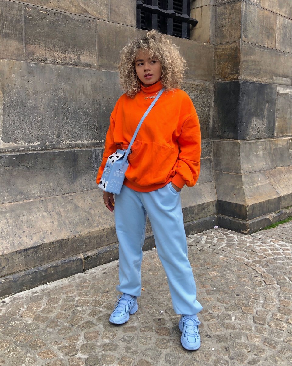
This is the most dynamic color scheme. When using two hues opposite each other on the color wheel – such as blue and orange – it guaranteed will create a very energetic look, just like fire and ice!

the use of the tools
You can use the schemes and color wheel to create your outfit.
blend in or stand out
The idea that color instantly makes you stand out so much depends on the hues of the colors.
more contrast or less
The bigger the contrast (opposites), the more vibrant your look will be.
color groups
We’ll be discussing color groups in the next post. Can you guys perhaps guess my favorite color group?
 how to wear color — part one
how to wear color — part one
 how to wear color — part two
how to wear color — part two
 how to wear color – part three
how to wear color – part three
 how to wear color – part four
